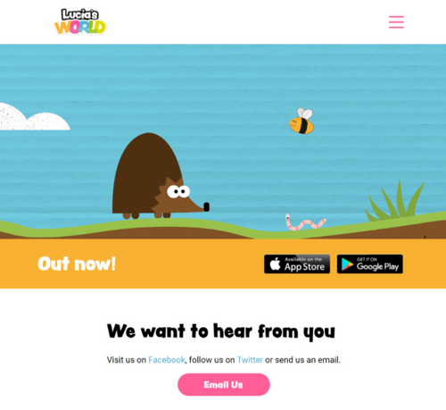
I wanted to create a website that would educate adults about Lucia's World.
Currently the website for Lucia’s world is basic, offering no real information or an existing structure that would keep the visitors on the page. The client knew that the initial look of their website is a good way to increase the number of users as it acts as a first impression of the overall quality of their product.
The main objective of this project is not to change how Lucia’s World is perceived by potential application users, but to use the current stylings, themes and general experiences to aid me in the development of this website and create an experience that would encourage users to explore the app further.
Due to the nature of the website their was no need to create overly complicated pages for a website that’s main objective is to increase the amount of app users.

For the final solution I combined a modern layout with the information that was available to me throughout Lucia’s Worlds current website and the media pack that was released on the apps launch. Through my user research I found that this website would only really be used by parents to see if this app would be good for their children. Therefore, I toned down the complexity that was in the initial design and went towards a more structured approach that gave the user what it wanted, information about Lucia’s World.